Site Redesign
UX / UI Case Study
Creed Boutique
Problem:
CREED Boutique has crafted prestigious fragrances since 1760, but their website did not match the quality of their perfumes or boutique service.
Solution
Create a website for their users that not only allows them to shop and learn about Creed, but parallels their in-store customer experience.
Lesson Learned
Scent is a powerful thing and a website for a thing like that should be even more so.
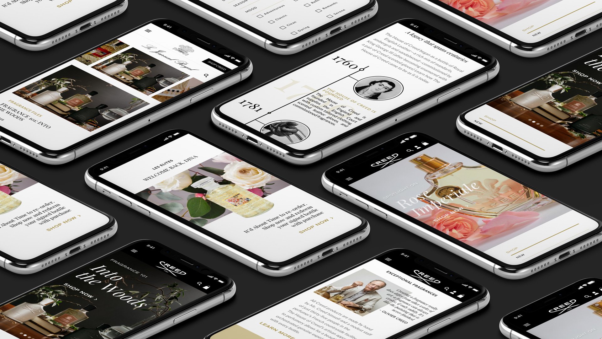
Brief
International cosmetics & perfumes - ICP wanted a partner to assist them with relaunching their north american www.Creedboutique.Com website in 2018. The new website should reflect a refined and modern aesthetic maintaining creed boutique as a luxury brand, that would optimize existing functionalities and elevate the user experience for newly introduced functionalities.
The new website was to reflect the brand’s ethos across 3 pillars:
1. Customer experience: implementing the brand universe through every touchpoint of the website, with impactful imagery and sensorial experiences, while maintaining the narrative of luxury in a modern and refined way
2. Customer engagement: approach all facets of the digital experience with a consumer-centric mindset to align with the personalized in-store customer experience one has when visiting a creed boutique
3. Customer acquisition and conversion: attract new users & convert them through digital innovations
Discovery
We immersed ourselves in the World of Creed via research and analysis of the history of the brand, the Creed consumer, Competitor Analysis, a little Fragrance 101, and a diagnostic of the current platform and consumer experience. Tools of the discovery phase included the following:
Google Analytics and SEO reporting
Brand and Competitive Research
Field research
Client UX workshop, questionnaires and meetings
Competitor interviews
Feature Inventory
Moodboards
User Research
Consumer group types
Consumer Questionnaire
Heat Maps
Scroll Reports
Path to Purchase testing
User Research
We also conducted user surveys offering a CREED gift certificate upon completion, and were able to gain a better understanding of Creedboutique.com’s needs.
3 Primary Users
Product Focused
Browsers
Researchers / One Time Shoppers
User Summary
Interests: travel, art, cocktails, style, fashion, other luxury brands, wine
Over 60% Male
Living in the US (New York, Texas, California, Florida, Illinois) and Canada
High Spend potential
Analytics & SEO report
28.6% ages 25-34
24.7% ages 35-44
18.5% ages 45-54
63% viewing from mobile, 32% purchasing
30% viewing desktop, 60% purchasing
Strengths: Brand Reputation, Clear Value Proposition, Solid Social Media Presence and Engagement
Weaknesses: Lack of keyword optimization content and filters for higher rankings
Challenges: keyword optimized content, competition with department store websites
Heat Mapping and Scroll Reports
PDP
Mobile
Simplistic approach cuts down user flow and prevents drop-offs
Users are utilizing Recommended items feature more than on desktop
Desktop
“sizes” image carousel and dropdown are top clicked sections on this page, but do the same thing. Utilizing these as separate information in redesign could help increase conversion
Users are curious to understand scent. How might we make users more confident about their scent choice throughout the site without words?
Home Page
User Majority goes straight to navigation buttons
Mobile does not offer search feature
Desktop users are clicking through to Video content and Featured Blog Category “Viking Diaries”—mobile, not so much
Path to Purchase
Users confusing voucher section with “coupon code”
Utilizing autofill expedites user journey,
There is no confirmation screen or final review before order is placed
PLP
PLP only allows sorting options for fragrances—does not allow user to filter based on preferences.
Scent Finder
Which direction is least intense?
How are these scents organized?
What do these categories mean?
FAQ
FAQ Trends focused on definitions and discounts/samples
How might we categorize and help users understand these fragrances better?
Information Architecture
We needed to simplify the navigation through eliminating redundancies and non-sensical flow. With so many static pages and a wonky navigation both on desktop and mobile, we believed it best to move forward with fewer top tier buckets, and more alluring sub categories. We also looked to condense pages without affecting SEO opportunities. Additionally, we wanted to update nomenclature to be more aligned with modern search terms. While the sitemap was fluid throughout the UX process, we were always working to optimize and stay conscientious of page templates and requested page designs.
Current Sitemap
SEO Sitemap
UX Strategy
Navigation and Search/Filter Functionality for usability and SEO tracking.
A personalized shopping experience to be consistent with Creed’s in-store experience.
Increase conversion rates among our mobile users
Redesigned Sitemap
Wireframes
We developed 2 conceptual directions for the e-commerce structure, then moved forward with a conglomeration of both directions that was used structurally throughout all wireframes to create our base flows while moving on to visual design.
Stronger navigational flow and filter/search capabilities to help increase site visits and conversion rates
Home page personalization for 3 levels of users (guest, new member, loyal)
Highly responsive for usability across all platforms.
Design Strategy
1. Strengthen Brand Voice Through Consistency
With a clear value proposition and solid social media presence/engagement, we wanted to enhance the already strong brand reputation within all facets of their website.
Solid type hierarchy and color story aligned with Creed brand guidelines
Customizable modules for various marketing initiatives, storytelling and calls to action
2. Elevate Navigation And Categorization
We created an entirely new navigation system based on our UX and SEO findings. This allowed for visual callouts to various sections of the website
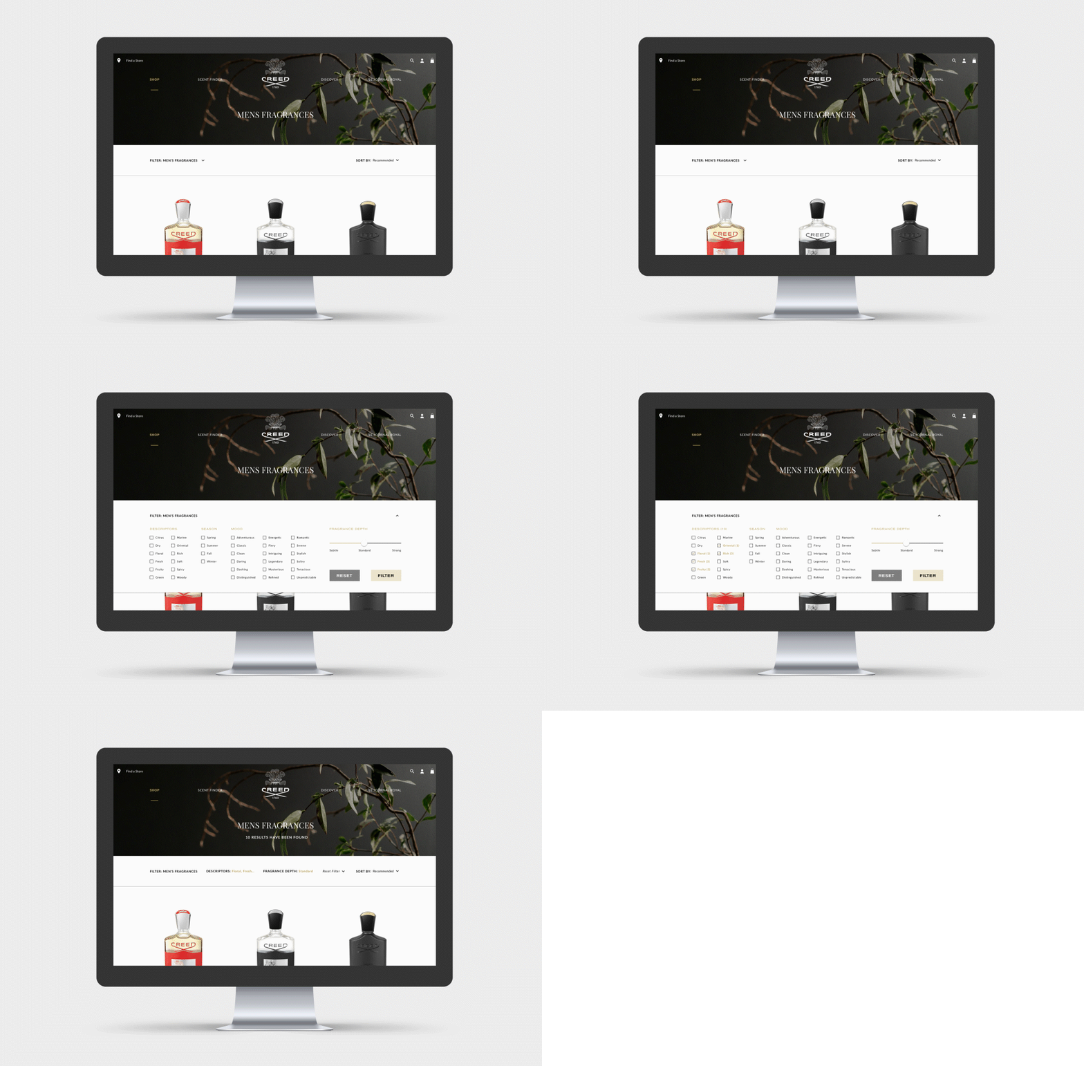
3. Shoppable Product Filtering System
The current website had very limited filtering capabilities, beyond gender and product type filters,, and recommended/a-z sorting. We created a system to pull results based on more user-specific needs, creating a more shoppable site (and visibility to search engines).
4. Represent Scent In A Sense-less Space
Driving sales for a fragrance on an e-commerce platform was a tall order, but we were ready to take on this challenge. Creed’s current website described people and places to explain their perfumes, but what if there was an easier way to do this? Scent is visceral and instinctual. Scent creates moods and recalls memories. Scent is complex, yet feels simple like …color.
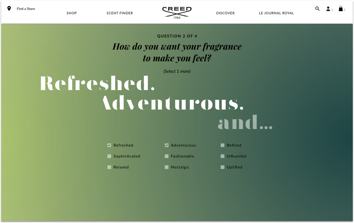
We visually mapped various notes into colors, allowing for a greater understanding of compound notes, and giving a visual signal to what olfactory pairings could be most appealing. We then integrated each perfume’s scent color story into various parts of the website.
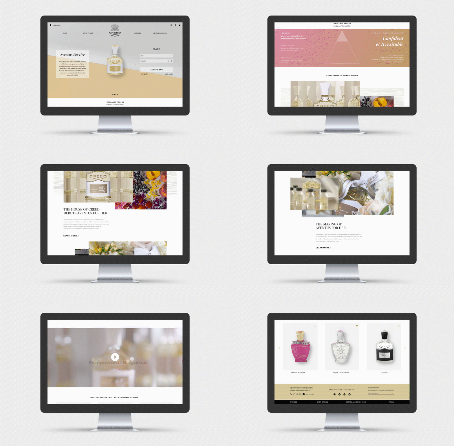
Fragrance Profile Within Product Page
Sampler Set Module
Scent Finder Results
Scent Finder Quiz
5. Simplified PDPs
Product details were restructured and simplified, we integrated lifestyle and editorial modules (where relevant), and we created a more visually stimulating PDP
A new SKU (Sampler Sets) also became available during our re-design. We not only integrated them into our scent finder quiz, we continued to detail the unique aspects of each recommended fragrance, including their fragrance color story.
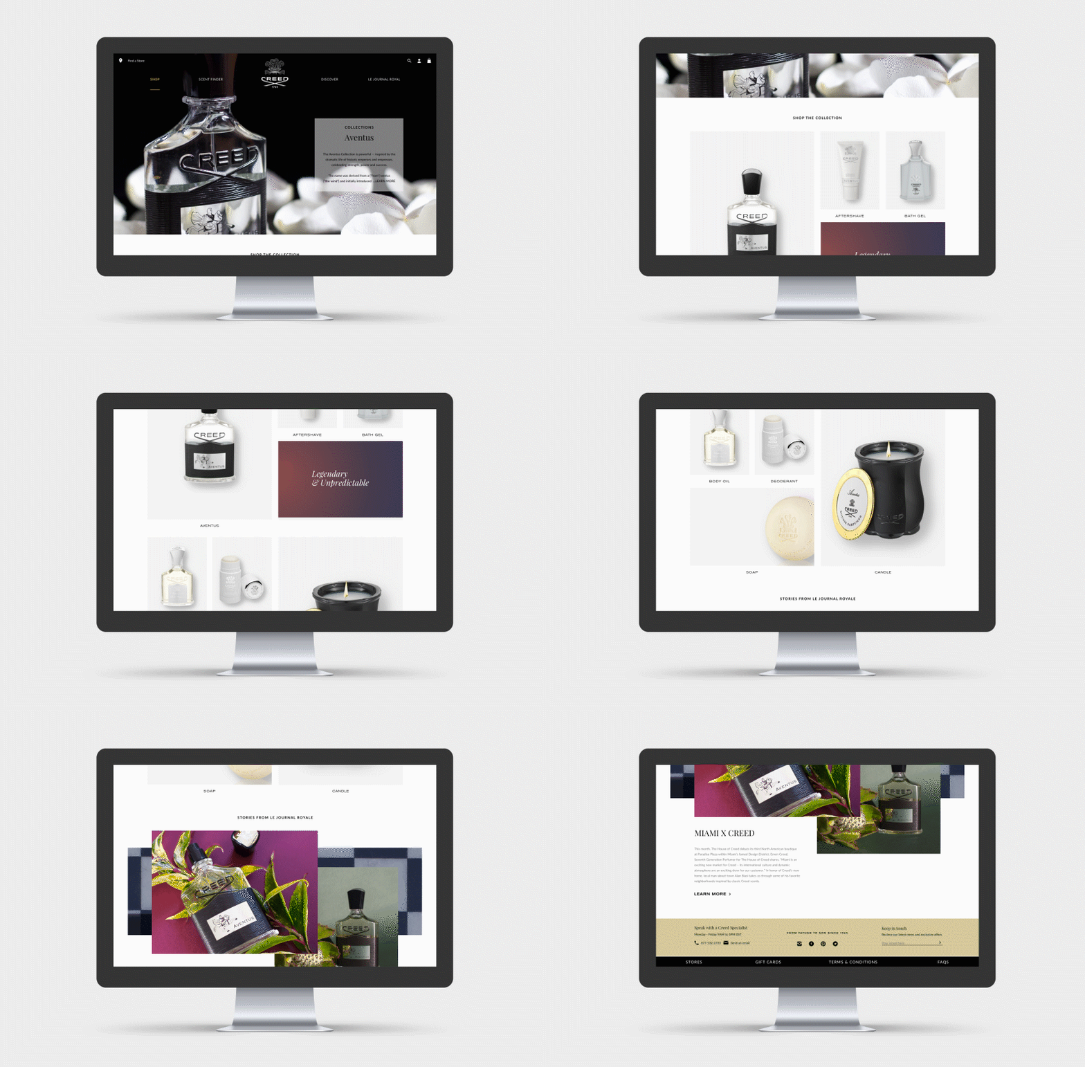
6. SEO-Friendly PLPs
The client was adamant about having ancillary/collection PLPs so we took this opportunity to showcase more of the personality of each fragrance. We took a little from our standard PLP and PDPs , further integrating our fragrance color stories, lifestyle, and editorial modules in a a more high level way.
7. Checkout
Desktop
Mobile
Click Here to view Creed Boutique.com
User Experience Design
User Interface Design


